ScaviTrav’s goal is to add value to users’ travel experiences by introducing a new way to explore. Travelers rely on mobile phones, not only for booking and logistics, but to find inspiration from hidden gems during their adventures.
The current mobile market is saturated with travel-planning applications and AR mobile games. By putting the two together, ScaviTrav is a niche app that aims to facilitate a deeper connection between people and their environment, all through a custom scavenger hunt.
Role
Competitive Research | User Interviews | Persona Creation | User Stories | User Flows | User Research Analysis | Affinity Mapping | Wireframing | Prototyping | Usability Testing | UX Writer
Tools
Invision | Balsamiq | Illustrator | Photoshop | Prott | UsabilityHub | Optimal Workshop

Project
Challenge
Design a scavenger hunt app to enable players to look for real locations at a destination. From local neighborhoods to popular travel destinations, players can create or join hunts to explore the area.
Problem
The scavenger hunt app market is saturated with plug-and-play type mechanics. These apps focus on popular points of interest that are widely available to users. However, an app with a custom feel is missing. This niche requires an interactive social aspect combined with local flavor that creates a genuine connection between travelers and their surroundings.
Approach
By applying user-centered design, the process will focus on creating rewarding gamification by offering unique travel information. I will first conduct research on competitors, interview users in order to understand what features meet users’ needs. These findings will guide the prototyping and ideation process.
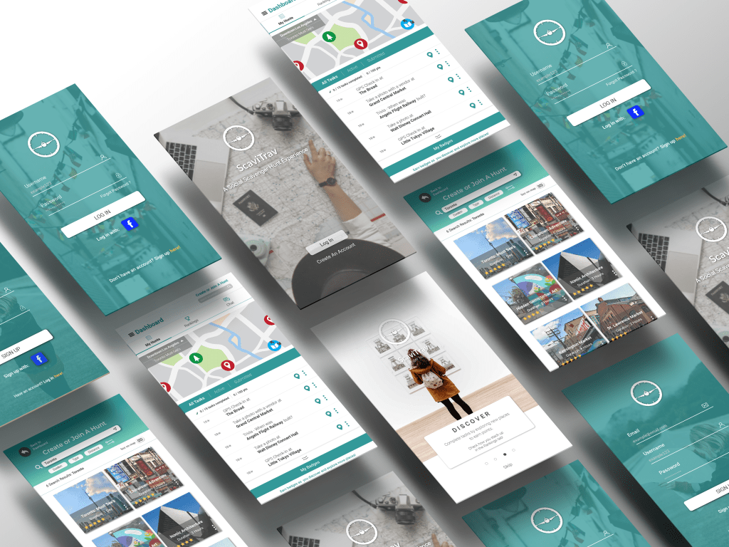
ScaviTrav Features
- search for scavenger hunts
- add scavenger hunts to user dashboard
- compete for high scores against friends and other players
- complete tasks through a submission page
Research
After conducting a competitive analysis on other scavenger hunt apps, I created a SWOT profile to gain insight on any open niches in the market. The two main competitors were Scavify and GooseChase, both of which are paid apps.
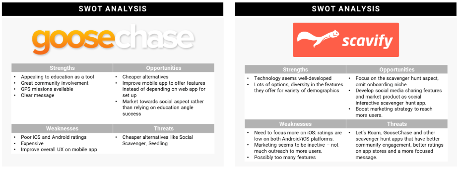
I created a Marketing profile and conducted a UX analysis of their app, to gain further insight to better inform my design solutions.

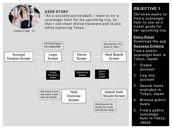
User stories were created to highlight users expectations from a scavenger hunt app and to connect with our potential users on a tangible level.
From here, I created a script and conducted in-person interviews with three people that fit the target audience: frequent travelers and gamers proficient with mobile apps.
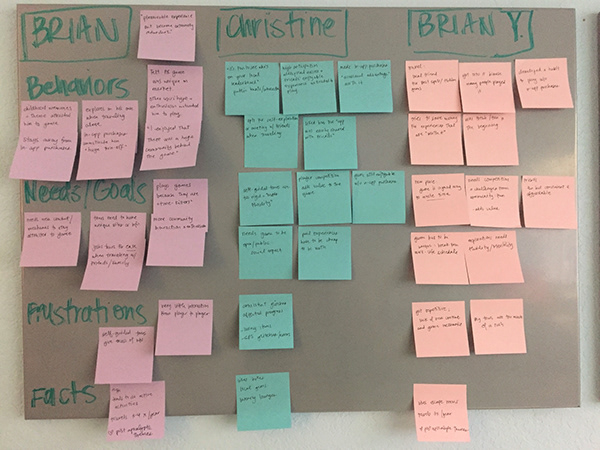
User Research Analysis
The data was synthesized into an affinity mapping board to identify patterns in expectations and pain points.
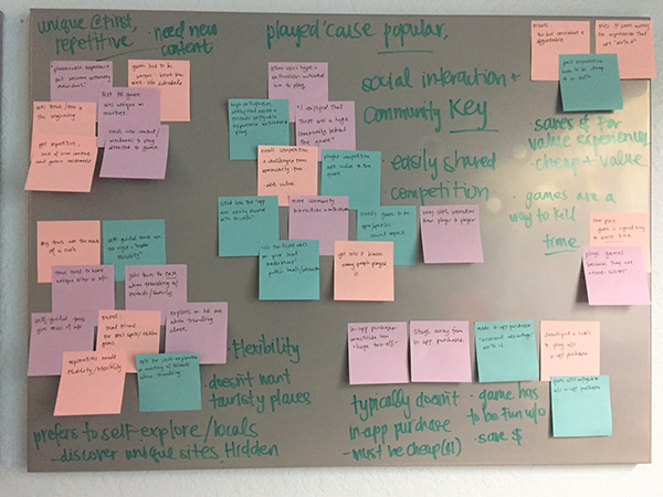
Key Insights
- When traveling, typically prefer to explore alone or with friends. Tours are too rigid and don’t usually include local/hidden gems, only tourist spots.
- In-app purchases should not impede game flow. They typically don’t make these purchases.
- They would rather invest in fun experiences (with friends) that are worth it. To be “worth it”, they need to be either cheap and/or have value.
- Community interaction is crucial in game’s value. They need competition and challenges from other players to stay interested.
- Previous AR experiences: fun/unique at first, but quickly became redundant due to lack of new content/mechanics.
- Mobile games are there to “kill time”: the game needs to be convenient to set up and play whenever.
Pain Points
There weren’t too many frustrations from the interviewees’ previous experiences: some app glitches and not enough community interaction were key frustrations.
However, the frustrations were impactful enough to uninstall and no longer use the app. This tells me their usage was based on hype/trend and waned after the initial influx of new players due to: lack of new content, repetition and lack of community interaction.
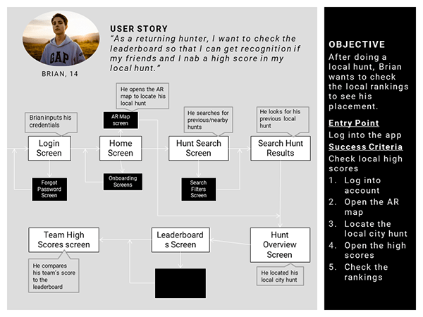
User Personas, User Journeys and User Flows
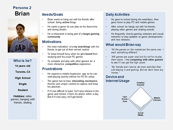
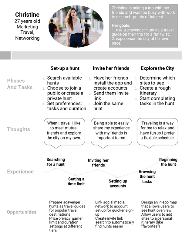
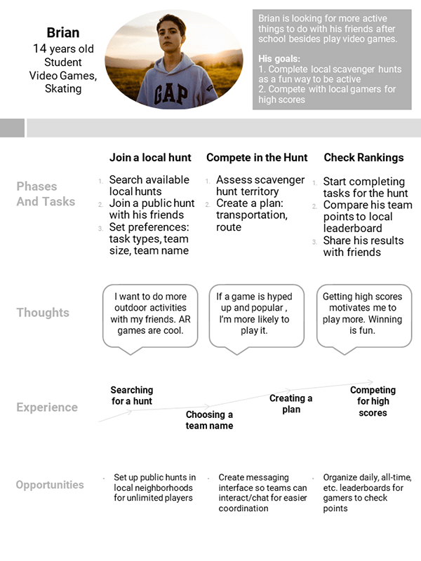
Once I had a better understanding of the users’ needs and wants, two primary personas were identified representing the target user demographics: Brian and Christine (named after two of my user interviewees!)

What service can ScaviTrav offer to Christine’s busy social life?
What is a key feature that will keep Brian logging back in to play?
I defined these processes in user journeys and user flows to plan out what tasks were important to each persona and the screens needed to carry them out successfully.
Wireframes and Heuristics
Paper Prototypes
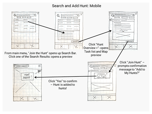
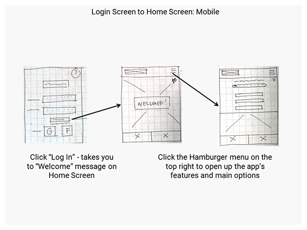
Lo-Fi Wireframes
Usability Testing
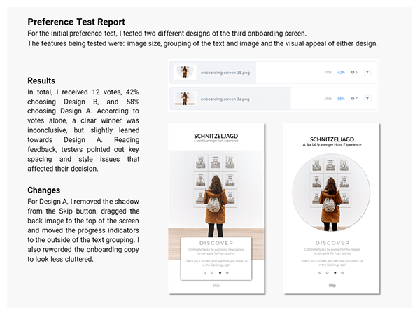
Once I had a viable lo-fidelity prototype, I began usability testing. Testing uncovered user pain points, my personal bias and the benefit of rapidly prototyping reinforced this idea: design does not need to be perfect, it needs to be functional. Continuing to iterate my prototype, I conducted preference tests to further validate my design decisions and gather more insights.
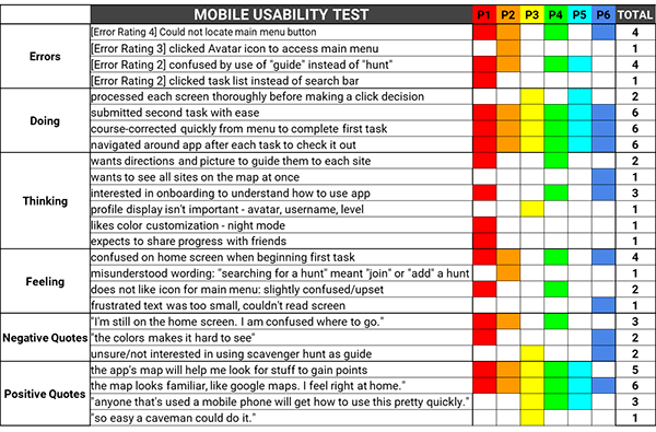
Key Insights
Issue 1 Main menu is difficult to locate
Solution choose different icon/symbol for menu, remove orange panel
Evidence 4 out of 6 users were unable to navigate away from home screen/locate main menu; one participant stated that icon didn’t associate with “menu”. User flow is completely stalled.
Issue 2 Avatar icon mistaken for Main Menu
Solution hide avatar (Settings) in main menu
Evidence 4 out of 6 participants clicked on the avatar first to try to access further options – participants stated that the avatar looked the most “promising” to lead to game’s functions
Issue 3 Interface color way is difficult to see
Solution Change color scheme to more contrasting/bold colors – more legible
Evidence 2 of 6 testers either suggested a “night mode”/dark scheme or expressed distaste for orange in current UI. Bolder colors will make copy/buttons easier to see in all light conditions
Design Principles
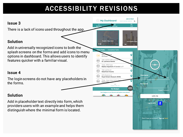
At this point, ScaviTrav’s lo-fi design grew exponentially. Applying “good design” guidelines, including visual design, accessibility guidelines along with peer feedback, exposed insights on how to polish the prototype further.
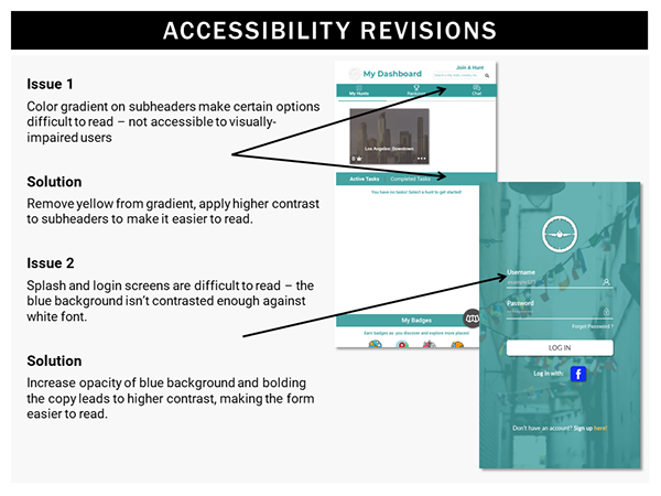
Accessibility Guidelines
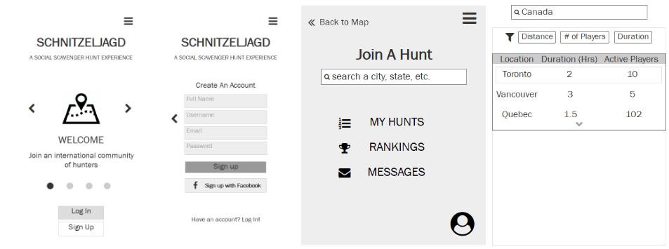
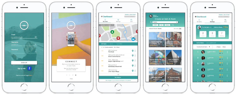
Hi-Fi Prototype
Design Solution
The app has come such a long way and I have truly enjoyed the UX journey. The user-centered design approach helped me maintain focus on what was essential and humbled my own design biases.
During the process, I found that users were easily bored over time with the lack of either new or unique content. There needed to be a way to interact and compete with friends, while being able to explore freely. By offering custom content and self-paced scavenger hunts, this opened a way for users to create an authentic connection with their world.
To check out the clickable prototype – please click here.
To watch the video demonstration – please click here.
